Ambient Office Lighting That Won't Fight Your Monitor
Most dim desks aren't short on light — they're short on ratio. Here's how to close the gap between your monitor and the room without touching the ceiling, plus what each spending tier actually gets you.
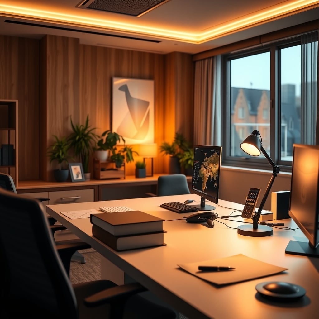
Most home offices don't have a light problem. They have a ratio problem.
If your monitor looks like a glowing slab floating in a dim room, the issue isn't that your ambient office lighting is too weak. It's that the gap between the screen and everything around it is too wide. Adding brightness rarely closes that gap — it usually widens it.
Here's the short version of what actually works. One diffuse, indirect source behind or above your display, aimed at a surface instead of at your eyes. Get that surface sitting at roughly 10% of your monitor's peak white luminance — the rule of thumb display calibration guidance has pointed to for years — then work through color temperature, flicker, and glare in that order. You can do all of it without touching the ceiling, without a landlord's permission, and for less than the price of a mid-tier mechanical keyboard.
Why Ambient Office Lighting Is a Contrast Problem, Not a Brightness Problem
Your eyes don't read absolute brightness. They read ratios, and they adapt to whatever dominates your field of view.
Park a 250-nit monitor in a room running 5 lux at the wall behind it and your pupils are being asked to work two jobs at once: stay constricted for the screen, stay open for the room. Blink rate drops during screen work anyway, and that constant micro-adjustment is why "dim room plus bright screen" ends in a headache more often than "bright room plus bright screen" does.
The Illuminating Engineering Society's recommended practice for office environments puts general work areas around 300–500 lux (roughly 30–50 foot-candles) at the work surface. More useful for a desk, it also suggests luminance ratios in visual display areas of about 3:1 between the task and its immediate surround, opening to about 10:1 toward the far background. Most home desks at night run somewhere between 20:1 and 50:1. That number — not lumens — is the one worth fixing.
Which is why "just add more light" is such a bad default. A 900-lumen fixture pointed straight down gives you a hot pool on the desk, a dark wall behind the monitor, and more glare bouncing off your keyboard. It raised the brightness and left the ratio exactly where it was.
If glare specifically is your problem, the diagnostic process in how to find a desk lamp that won't strain your eyes is worth reading before you spend anything — you can usually identify the source in about ten minutes with a sheet of paper.
The other half of the fix is free: dropping monitor brightness from 100% to something appropriate for the room. Nobody wants to hear it, because it feels like a downgrade. It's the single largest ratio change available to you at zero cost.
The Three Layers Most Desk Setups Are Missing
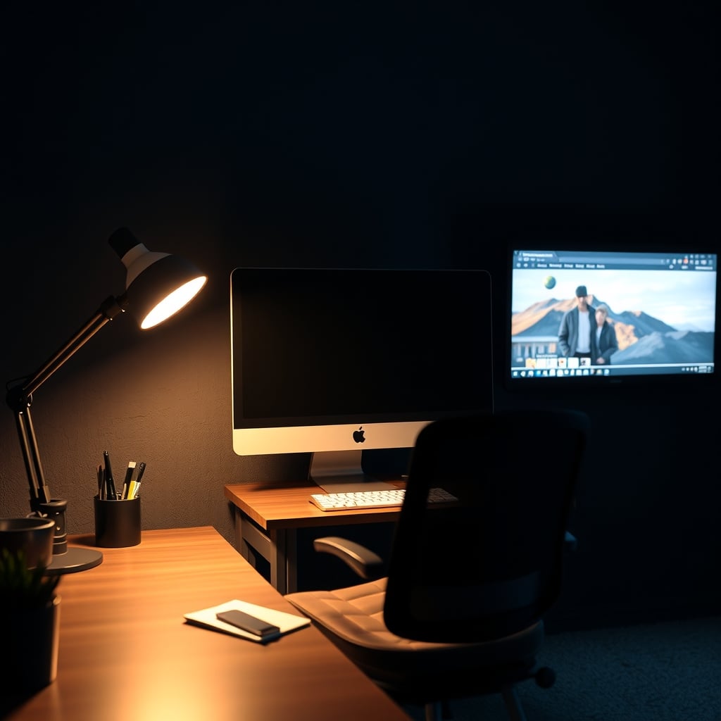
Most people buy one lamp and hope. A room that feels genuinely finished usually has three distinct jobs being done by three different sources.
Layer one — screen-relative ambient. This is the light behind and above the display. Its only job is to knock down the contrast between the monitor and the wall. Diffuse, indirect, dimmable down to near-nothing, and positioned so it never crosses your line of sight. Target the 10% figure above. A bias strip stuck to the back of the monitor handles this if the wall is close; a small indirect floor uplighter does it better if there's some distance to work with.
Layer two — room fill. This is the bounce. Light fired at a ceiling or a wall and reflected back is what makes a room feel open instead of cave-like. Here's the part most buyers miss: ceiling reflectance matters more than fixture output. A matte white ceiling bounces back the large majority of what hits it; a dark-painted ceiling absorbs most of it. If your ceiling is dark, an uplighter is fighting a losing battle, and a wall-washer aimed at a pale wall will do more with less wattage.
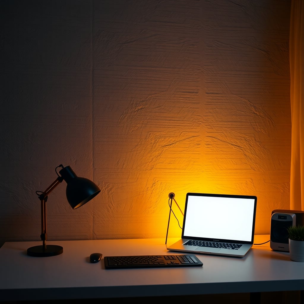
Layer three — the texture layer. This is the aesthetic move, and the one that makes a desk look intentional rather than merely lit. A warm source — 2200K to 2700K — grazing a textured surface at a shallow angle rakes across the material and pulls out every bit of grain, plaster, brick, or slat. Aim it across the surface, never at it. This layer adds almost nothing to usable light and almost everything to how the room reads.
The order matters. Fix one before two, and two before three. A room with only layer three is a mood board with a monitor in it.
If you want these layers on schedules rather than switches, this desk light automation buying guide covers what's actually reliable in 2026 and what isn't.
Color Temperature and CRI: The Two Numbers That Decide How a Room Feels
Two products can both say "3000K" and look like they came from different planets. CCT tolerance, tint, and color rendering all move independently.
Color temperature. 2700–3000K reads warm and domestic. 3500–4000K reads neutral and workmanlike. 5000K and up reads clinical. The practical rule: pick one anchor temperature for your desk area, then vary by no more than about 300K between layers. Put a 2700K accent wash and a 5000K uplighter in the same sightline and both will look wrong — the eye judges color relative to its neighbors, not in isolation. Warm light will look sickly orange next to cool light, and cool light will look blue and harsh next to warm.
The old Kruithof curve suggested cooler light feels comfortable at high illuminance and warmer light at low illuminance. It's been challenged in modern research, but the practical takeaway survives: a 5000K room at low brightness feels like a waiting room at 3am. If you work in the evening, warm and dim beats cool and dim.
Color rendering. CRI (Ra) of 90 or better is the floor for anything lighting a work surface. But CRI is an average of eight pastel swatches, and it's a poor predictor of how wood, skin, and deep reds look — cheap LEDs routinely score Ra 80+ while their R9 (deep red) value sits under 20. That's the mechanism behind "why does my walnut desk look grey under this lamp." If the spec sheet lists TM-30 values, Rf around 90+ with Rg near 100 is a genuinely good sign. If it doesn't list them at all, assume average.
For anyone working past sunset, what actually works in circadian desk lighting is a better place to dig into timing than CCT alone.
Flicker, Glare, and the Specs That Never Make the Box
Neither of these shows up on a retail listing, and both are more likely to bother you than a 100-lumen difference.
Flicker. Most budget LEDs dim using pulse-width modulation, and the cheaper the driver, the lower the switching frequency. IEEE 1789-2015 is the reference standard here, and its low-risk boundary tightens as frequency drops — at 100 Hz it works out to roughly 8% flicker depth, a bar plenty of inexpensive dimmers don't clear. You don't need a lab to check. Point your phone camera at the light with the shutter as fast as it goes, or film it in slow motion. Visible banding or rolling bars means the driver is cycling in a range your visual system can register even if you can't consciously see it. The fix is a constant-current driver, or simply dimming less aggressively.
Glare. Three flavors, and only one is obvious:
- Direct glare — an exposed LED or bare bulb in your field of view. Fix: diffusers, or get the source out of sight.
- Veiling reflections — light bouncing off a glossy desk pad, glass, or lacquered wood into your eyes. Fix: matte surfaces, or move the source off the reflection angle.
- Reflected glare on the screen — a matte panel scatters it rather than mirroring it, but a source positioned above and slightly behind your head still lands on the screen as a wash. This is the one a well-designed monitor light bar solves with asymmetric optics that throw light down and forward rather than back into the panel.
The Fit Problems Nobody Mentions Until It's Too Late
The physical details cause more returns than light quality does.
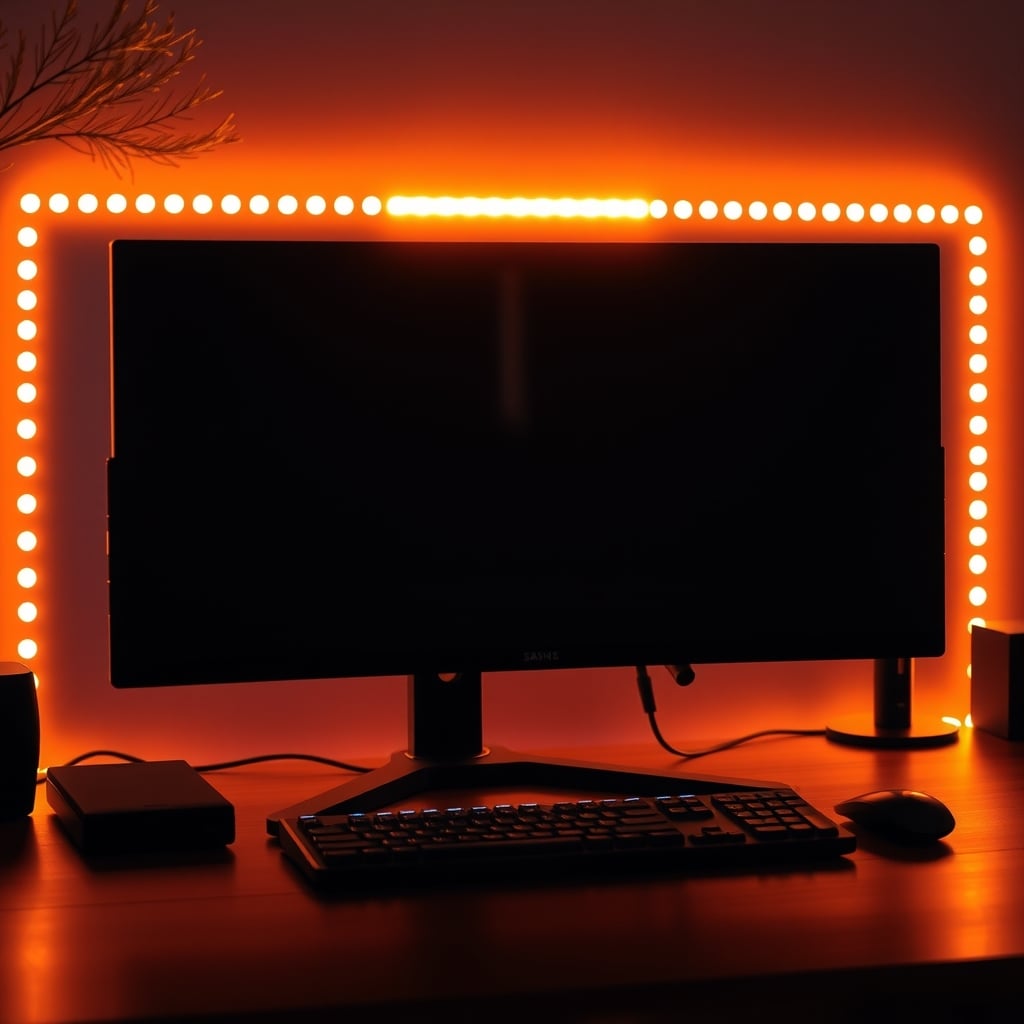
Monitor light bar clamps. Most counterweight designs are built for flat-backed monitors somewhere in the 10–25mm thickness range. Curved panels — anything from 1000R to 1800R — typically need a shim or a curved-specific bracket, and even then the bar may not sit level, which you'll notice the moment the light pool on your desk goes lopsided. On a thin-panel display mounted on a VESA arm, the added weight up top can also introduce a slight droop.
Webcam collision. A light bar occupies the top of the monitor, which is exactly where a lot of webcams want to sit. Measure before you buy, or plan to move the camera to a tripod or a shelf.
Ceiling geometry. Uplighters assume a flat, pale ceiling. A tray ceiling, exposed beams, or a sloped roofline turns your bounce into a bright band and a dark rest-of-room. In those rooms, wall-washing beats uplighting every time.
Adhesive versus your deposit. Mounting tape on painted drywall is a known way to lose part of a security deposit — adhesive strips take the paint with them, especially on a fresh coat. Freestanding, or a magnetic mount on a metal surface, is the renter-safe answer. This is also why "no wiring, no holes" kits sell at a premium; the premium is the adhesive engineering, not the light.
Power budget. Do the arithmetic before you plug anything in. Five meters of 24V strip drawing 14.4W per meter is 72W total, which is 3A at 24V. A 5A driver runs cooler and holds dimming stability at low output better than a 3A unit pushed to its limit. And over long runs, 24V drops less voltage than 12V across the same distance — which is why 12V strip that looks fine at one end goes visibly warmer and dimmer at the other.
What $60, $150, and $400 Actually Buy You
Tier Typical spend What you actually get Best for Where it falls short Entry $40–80 A freestanding indirect floor uplighter with a diffuser, or a basic monitor light bar. Fixed 3000K or 4000K, single brightness knob. Renters, first fix, small rooms with a pale ceiling Often Ra 80 with R9 under 20; dimming may buzz or flicker at low output; one fixed temperature Mid $100–200 Tunable-white indirect source covering roughly 2700–5000K, or a light bar plus a screen-relative bias strip on separate controls. Ra 90+, constant-current driver. Anyone who works both day and night and wants to shift the room's mood Still a single light source, so a dark ceiling stays a dark ceiling; app control is usually an afterthought High $300–500 Multi-zone rig: tunable indirect uplight, warm accent wash for the texture layer, and a screen-relative strip, all on one controller with saved scenes People who treat the room as a backdrop for streaming, photography, or daily enjoyment Complexity, app dependency, and the honest fact that most of the visual result is reachable at the mid tier if your walls and ceiling are lightThe uncomfortable takeaway from that table: above roughly $200, you're mostly buying control and scene recall, not better light. The physics of "diffuse light bounced off a pale surface" doesn't get more expensive.
Five Mistakes That Keep Ambient Office Lighting Looking Flat
1. Lighting the room instead of lighting a surface. A lamp in the middle of a room makes a bright middle and dark corners. Aimed at a wall or ceiling, the same lamp makes the whole room read as lit. Same wattage, completely different result.
2. Mixing color temperatures in one sightline. Covered above, but it's the most common one. If your ceiling fixture is 4000K and your accent lamp is 2700K and you can see both at once, the room will look broken no matter how good either product is.
3. Leaving the source visible. Diffuse everything that's in your field of view. A bare strip on a shelf edge is a glare source pretending to be decor.
4. Judging the setup at 2pm. Rooms are lit by daylight for a fraction of the hours you'll actually use them. Set your lighting at night, when it's the only light in the room.
5. Turning everything up instead of bringing the contrast down. If the wall behind your monitor is too dark, you have two levers. Most people reach for the brighter one. The cheaper move is lowering the display.
There's a whole psychology layer to this — why ambient light changes how focused a room feels digs into the perception side, which is worth understanding before you blame your own attention span.
Who Should Buy What, and Who Should Skip It
Renting a dim apartment. One freestanding indirect uplighter in the $60–120 range, aimed at the ceiling, plus a cheap strip for the accent layer. Skip hardwired anything, and skip mounting tape.
Editing or color-critical work. A D65 bias strip at roughly 10% of peak white behind the monitor, and neutral 4000K room fill with Ra 95+ and TM-30 data if it's published. Skip warm accent lights during grading — a 2700K wash in your peripheral vision will shift how you read neutrals on screen.
Small home office, pale ceiling, one outlet. A single tunable-white uplighter in the $100–150 band does about 80% of what a full multi-zone rig does. Buy that first and stop.
Streamers. Your key light does the work. Ambient is for the wall behind you, where a gradient reads better on camera than a flat wash. If your face still looks flat, the problem is upstream of the ambient, not in another lamp.
Skip it entirely if: you work mostly during daylight in a room with good windows, or your actual complaint is eye strain from screen brightness. In the second case, dim the display and enable the correct color profile before you spend a dollar on lighting. Free fixes first.
The Bottom Line
Fix the ratio before you fix the room. One diffuse, indirect, flicker-free source aimed at a pale surface behind or above your monitor, sitting at roughly 10% of your display's peak white luminance, will do more for how your space looks and feels than any fixture you can buy for four figures.
For most people, that's a $60–120 indirect uplighter or a well-diffused monitor light bar, set to 3000K in the evening and 4000K during the day, with Ra 90+ and a constant-current driver. Add a warm accent source at 2200–2700K grazing a textured wall if you want the room to look designed rather than merely lit.
Skip the multi-zone controller until you've lived with two lights for a month. Skip anything you have to hardwire into a rental. And skip brightness as a solution — it's the one lever that almost never improves the ratio that's actually bothering you.
Frequently Asked Questions
Do I really need ambient lighting behind my monitor?
Not always. If the wall behind your screen is pale and there's daylight in the room, you may already be fine. The setup that needs it is a monitor whose surrounding wall reads much darker than the screen at night. Simple test: look at the wall, then look at the screen. If the wall looks grey-brown or black, you'd benefit. If it looks like a normal wall, save your money.
What color temperature should ambient office lighting be?
Somewhere between 3000K and 4000K for a workspace. The warm end (2700–3000K) works better in the evening, the neutral end (3500–4000K) during the day. The rule that matters more than the specific number: keep every source in the same sightline within about 300K of the others, or the room reads as broken even when each fixture is fine.
Is a monitor light bar better than a desk lamp?
If glare is your problem, usually yes — asymmetric optics push light down and forward instead of back into the panel. If your problem is a dark wall behind the monitor, a light bar does almost nothing, because it lights the desk rather than the wall. Match the tool to the actual complaint.
How many lumens do I need for a home office?
Lumens are the wrong unit for this decision. Lumens measure a fixture's raw output; lux measures what actually lands on a surface, and illuminance falls off steeply with distance. The IES recommendation for general office work is around 300–500 lux at the work surface. A cheap light-meter app on your phone can tell you where you actually stand, and the answer is usually 'the wall behind my monitor,' not 'the desk.'
Do smart bulbs make sense for office ambient lighting?
Only if you already run a hub or ecosystem. Tunable white matters far more than full color for a workspace, and a lot of budget smart bulbs ship with worse flicker drivers than their non-smart equivalents. If you don't already have an ecosystem, a plain dimmer and a tunable-white fixture gets you most of the way without the app dependency.
Written by
GlowRig Editorial researches and writes practical guides about desk setups and home office gear. Our articles are produced with the help of AI research tools and are reviewed for accuracy against manufacturer specifications and public user feedback. We may earn a commission from affiliate links, which never affects our recommendations.
Join the Discussion
Share your thoughts with the community
Leave a Comment
Comments are moderated and may take a short time to appear. Links are not permitted.