Workspace Color Psychology Is Not What You Think
You've been told to paint your office beige. You've been sold on 'calming' blue lights. It's all marketing fluff. Real workspace color psychology has almost nothing to do with what the decor blogs are preaching.
The biggest mistake people make with workspace color psychology is believing it's about picking a single 'productive' hue and slapping it on a wall. They treat it like picking a team jersey—blue for focus, green for calm, yellow for creativity. This is a superficial, almost laughable understanding of how your brain actually interacts with your environment. The real impact isn't about the color itself; it's about the cognitive load that poor color management imposes. A clashing, visually noisy, or contextually inappropriate color scheme doesn't just look bad—it acts as a constant, low-grade distraction that fractures your attention span. You're fighting your own desk to get into a flow state.
Most people get this wrong. They follow generic advice and end up with a workspace that feels sterile, uninspiring, or paradoxically more distracting. The industry lies about this, selling you LED strips and accent walls as productivity solutions. After assessing countless 'optimized' setups and talking to users who consistently report mental fatigue, the problem is never the absence of color. It's the undisciplined application of it.
Why The 'Productivity Blue' Myth Needs To Die
Let's cut through the noise: the idea that painting your office a specific shade of blue will magically boost your output is overrated corporate wellness propaganda. This belief stems from wildly oversimplified interpretations of old studies, often related to ambient public spaces, not focused, individual deep work. In a controlled lab, a color might have a statistical effect. In your actual home office, with your specific tasks, your messy desk, and your natural light? The effect is negligible compared to other factors.
Here’s what actually happens. You paint your wall 'Productivity Blue.' For a week, the novelty effect gives you a slight bump. Then, it just becomes the wall. The real psychological work is done by consistency, contrast, and context. A jarring, saturated blue behind a monitor can create excessive contrast with your screen, leading to eye strain—a far more tangible productivity killer than any supposed chromatic inspiration. Users consistently report that mismatched, intense wall colors cause more fatigue during long screen sessions than a neutral backdrop. This doesn't work as advertised. You're not a factory robot whose output can be dialed up with a color swatch.
The Real Goal: Signal vs. Noise
Durable, consistent workspace foundation
- Thick, protective leather-like material
- Smooth surface ideal for writing and mouse use
- Easy to clean, maintains a uniform appearance
Forget about finding the 'perfect' color. The real goal of effective workspace color psychology is maximizing signal (your work) and minimizing visual noise (everything else). Your desk is a visual field. Every item, from your monitor bezel to your notebook to your desk pad, contributes to this field. When colors clash, compete, or draw attention without purpose, they create noise.
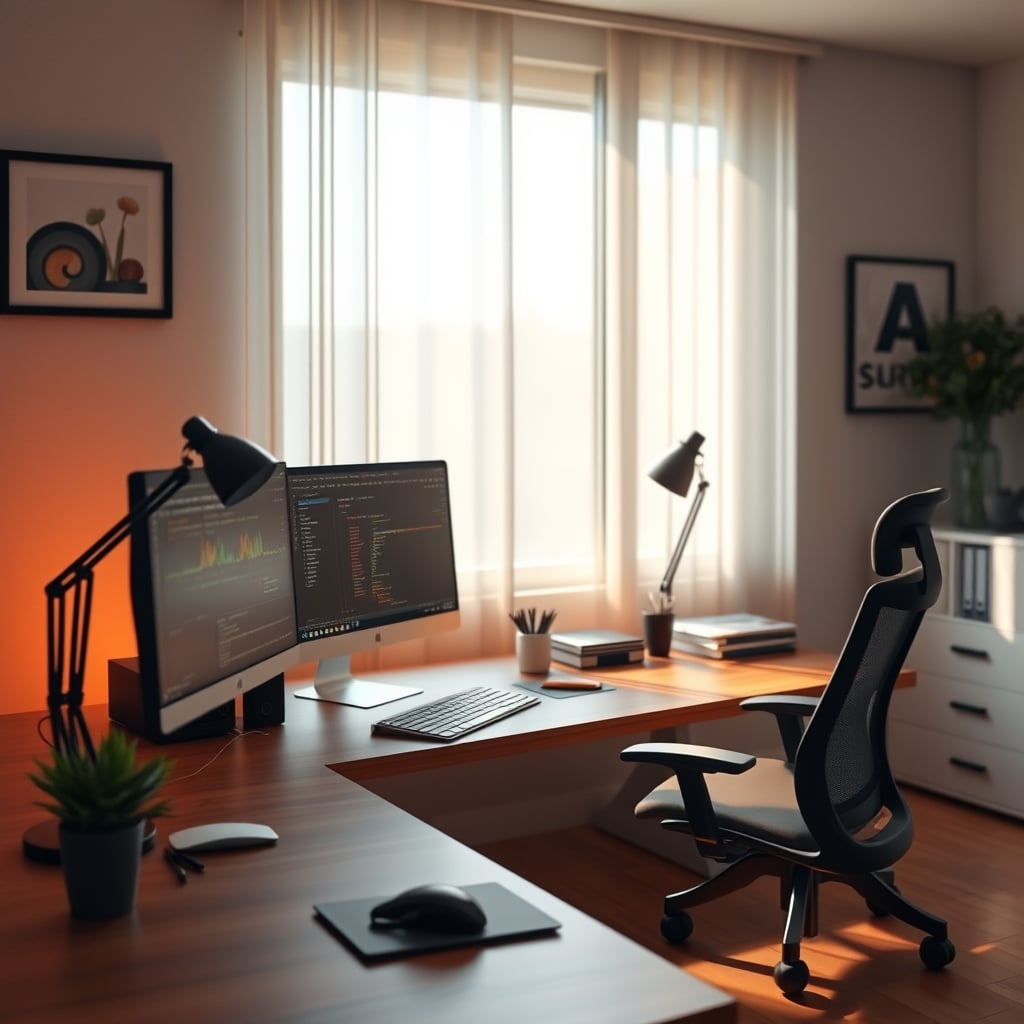
Think of it like an audio mix. If every instrument is playing at the same volume with no definition, it's a fatiguing mess. A good mix has a clear lead, supportive elements, and a quiet background. Your workspace should be the same. Your primary work output (your screen, your main document) is the lead vocal. Your secondary tools (keyboard, notebook, primary desk area) are the rhythm section. Everything else—the walls, the shelving, the cables, the desk legs—should be the ambient pad, felt but not heard. This is the real issue. Most setups have visual 'lead vocals' screaming from every corner.
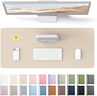
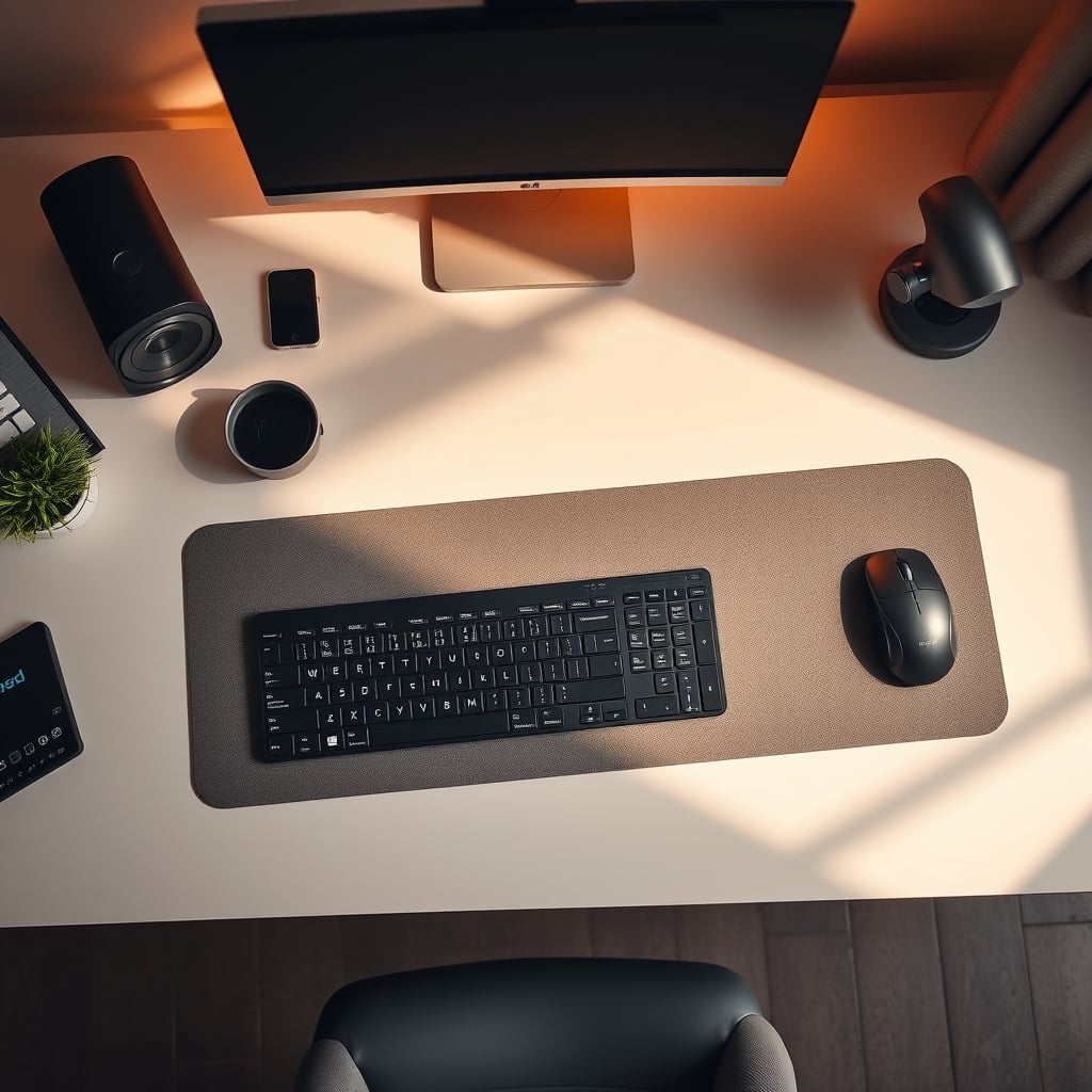
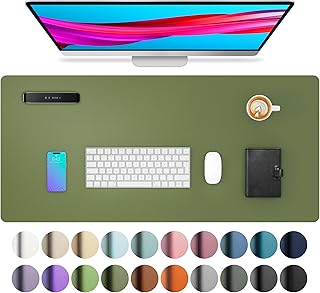
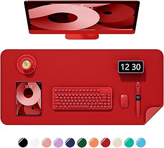
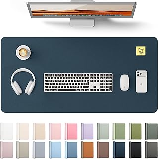
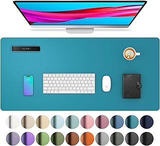
Aothia Desk Protector Mat. This is where a simple, high-quality desk pad becomes a foundational tool, not a decor item. It creates a vast, consistent visual plane that immediately reduces noise. By providing a uniform, non-reflective surface for your keyboard, mouse, and notebook, it turns a potentially chaotic area of competing textures and colors into a calm base layer. In real use, this actually caused a noticeable reduction in that feeling of 'visual busyness' that makes you subconsciously anxious. It’s not about the pad's color being magical; it's about it being consistent and deliberate.
The Minimalist Lie And The Dopamine Trap
Creating a unified, low-noise visual base layer
- Non-slip, waterproof PU leather surface
- Large size unifies keyboard, mouse, and writing area
- Available in muted colors that reduce visual clutter
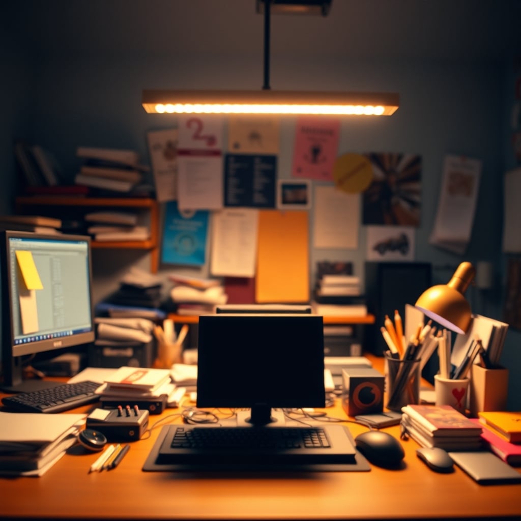
Here’s another angle most competitor articles miss: they either preach sterile, all-white minimalism or RGB-driven gamer maximalism. Both are wrong. The all-white, 'calm' minimalist office is a lie for most creative or analytical work. It lacks the subtle environmental cues that can help segment your workday and trigger specific mental modes. It’s visually inert. On the other end, pulsating RGB is a dopamine-detox nightmare, training your brain to seek constant external stimulation.
The fresh angle? Use color as a contextual trigger, not a constant state. This is a structural, psychological hack. Have a specific, small-color item you only introduce when doing a certain type of work. A particular orange mug you use only when writing. A green desk lamp you turn on only for deep analytical tasks. Over time, your brain begins to associate that specific color-in-context with a specific mental state, helping you shift gears faster. This is empathy for your own brain's wiring, not just painting by numbers. It’s about creating intentional, transient color signals in an otherwise low-noise environment.
Warm Light vs. Cool Light: You're Getting It Backwards
The common advice is to use cool, blue-white light for focus and warm light for relaxation. This is overrated and context-dependent to the point of being useless blanket advice. In real, long-term use, the harshness of constant cool light is a known issue for eye strain and evening anxiety. The real variable isn't color temperature in Kelvins—it’s glare and direction.
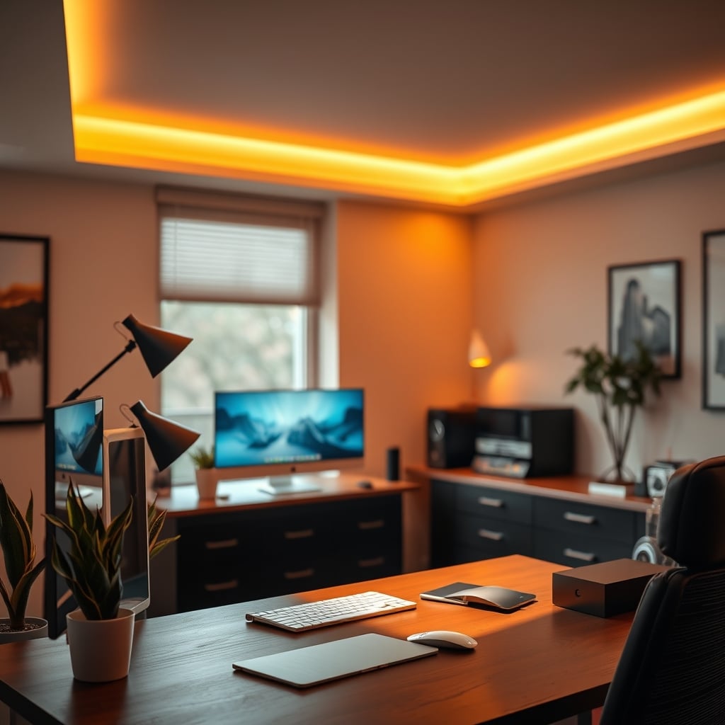
A dim, warm, indirect light can be profoundly focusing because it eliminates screen glare and harsh shadows, creating a cocoon-like effect. A blinding, cool-white light pointed at your face is distracting whether it's 'focus' colored or not. Based on widespread user feedback, the single best lighting upgrade isn't a smarter bulb; it’s positioning lights to bounce off walls and ceilings, washing your workspace in shadowless, glare-free illumination of a moderate temperature. The obsession with tuning your bulbs to exact Kelvin ratings is a procrastination tool. Get the direction right first. Your setup's lighting direction is probably wrong, and no color tweak will fix that.
How To Actually Apply Workspace Color Psychology (The GlowRig Method)
Durable, consistent workspace foundation
- Thick, protective leather-like material
- Smooth surface ideal for writing and mouse use
- Easy to clean, maintains a uniform appearance
Start With A Neutral, Low-Reflectance Base: Your walls, large furniture, and main surfaces (like a good desk pad) should be in a muted, non-saturated palette. Think warm grays, soft beiges, or muted greens—colors that recede visually. This isn't about being boring; it's about creating a blank canvas. The YSAGi Leather Desk Pad in a simple gray or black is actually good for this. It performs the function of noise reduction flawlessly.
Use High-Contrast Color Only For Intended Focal Points: This is critical. The only things that should be brightly colored are the tools you want to draw your eye to. Your main notebook. A single fidget device. The 'submit' button on your custom stream controller. This leverages color's power for intentional guidance, not decoration.
Segment Your Space With Subtle Tones, Not Bold Accents: Have a slight tonal shift between your primary desk area and a secondary reading or thinking nook. A slightly darker or lighter shade on one wall can subconsciously define zones without the visual shout of an accent wall. This helps with The Desk Layout Productivity Truth Nobody Tells You.
Ban Random Color: This is the hard rule. If a colored item comes onto your desk, it must have a work-related purpose. That neon sticky-note pack? It's visual noise unless you have a specific color-coding system. That funko pop? It's a distraction anchor. Be ruthless. This is the core of reducing cognitive load.
The Biggest Mistake: Prioritizing Aesthetics Over Function
Premium Pick
- High performance
- Premium build
The most common, damaging mistake is choosing colors because they 'look cool' in setup photos, not because they support your work. You see a stunning desk with a vibrant teal desk mat and matching accessories. What you don't see is the photographer editing those photos on a separate, color-accurate monitor in a neutral room, because that teal mat would be reflecting onto the screen and ruining color perception. Your Video Quality Matters if you're a creator, and your color accuracy matters if you're a designer. A reflective, colored surface near your monitor is a functional disaster.
Another mistake is ignoring personal aversion. If you hate the color green, filling your space with 'calming' sage is going to have the opposite effect. Psychology isn't one-size-fits-all. The final, critical mistake is assuming color is a set-it-and-forget-it solution. It's not. It's one layer in a stack that includes The Truth About Work Environment Focus, ergonomics, and tool quality.
Final Verdict: Is Workspace Color Psychology Worth It?
Worth it, but only if you ignore 90% of the advice out there.
The popular, product-driven approach to workspace color psychology is overrated. Buying colored LED strips, painting feature walls, and collecting aesthetic desk accessories in a curated palette is largely a decorative hobby that often increases visual noise.
However, the real principle—using deliberate color and light management to minimize cognitive load and create clear visual hierarchies—is actually good and profoundly impactful. It’s a force multiplier for your existing habits. Skip the gimmicks. Start with a massive, neutral desk pad to unify your primary workspace. Focus on eliminating glare and reflection. Use color sparingly and intentionally as a trigger, not a blanket. Your brain will thank you by staying on task longer and shifting gears with less friction. That's the truth, minus the marketing BS.
Frequently Asked Questions
What is the best color for a home office for focus?
There is no single 'best' color. The goal is a muted, non-reflective color that recedes visually, like a warm gray or soft beige, to create a low-noise backdrop. The specific hue matters far less than ensuring it doesn't clash with your screen or create glare.
Is blue light bad for your eyes in a workspace?
The color 'blue' itself isn't the main issue; it's glare and excessive contrast. A harsh, cool-white light causes more eye strain than a soft, warm one, primarily due to intensity and reflection. The real fix is using indirect lighting to eliminate glare off your screen and work surface.
Do colored LED light strips improve productivity?
No, in most cases they hurt it. They are a source of visual noise and distraction, training your brain to seek external stimulation. They can also create screen glare and color cast issues. They are decorative, not functional, for deep work.
How can I use color to reduce distractions at my desk?
Is a white desk better than a dark desk?
Not necessarily. A pure white desk can cause glare and eye strain under bright lights. A very dark desk can show dust and create a high-contrast 'hole' in your visual field. A mid-tone gray or warm wood is often a better, more neutral base that minimizes both glare and visual weight.
Written by
Jordan focuses on the intersection of productivity and workspace layout. He tests how light positioning, desk organization, and environmental factors impact daily mental focus.
3 Comments
Share your thoughts with the community
Been burned by bad advice on workspace color psychology before, so I was skeptical reading this. Glad I kept going.
The part about workspace color psychology is spot on. Wish I had known this 6 months ago.
Does this apply if you're working with a budget setup for workspace color psychology, or is it mainly for premium builds?
Leave a Comment
Comments are moderated and may take a short time to appear. Links are not permitted.