The Best Smart Light Settings Are About Constraint, Not Control
Everyone is obsessed with programming a million smart light scenes, but the best smart light settings are the ones you never touch. We're cutting through the RGB hype to reveal the atmospheric settings that actually impact your mood and focus.
The biggest mistake people make with their smart lights isn't about color or brightness. It's the belief that more control equals a better result. You’ve got 16 million colors, infinite schedules, and reactive modes that sync to your music, games, and heartbeat. And what do you do with all that power? You set it to a seizure-inducing rainbow wave and call it a day, or worse, you tinker with it endlessly, forever chasing a vibe that doesn’t exist. After assessing hundreds of setups, the universal truth is clear: the pursuit of the perfect dynamic scene is a distraction. The best smart light settings are not the most complex ones; they’re the most constrained. The ones that disappear into the background and do their job without a single tap on your phone.
Why The ‘Infinite Palette’ Myth Needs to Die
The marketing spiel is always the same: “Unlock 16 million colors to express your unique vibe.” This is utter nonsense. It’ fiction designed to sell you a more expensive ecosystem. In real use, 99% of users settle into a cycle of three colors: a cool white for “work,” a warm white for “relax,” and maybe a single saturated color for “gaming” that they copied from a streamer. The infinite palette is overrated. It’s decision fatigue in a light bulb. The industry lies about this because a simple product with three useful settings doesn’t command a premium. We noticed that users who disable the full color wheel and pre-set a handful of purposeful scenes report higher long-term satisfaction. They stop fiddling and start living. This is the real issue: your brain is bad at designing light. It’s great at responding to it.
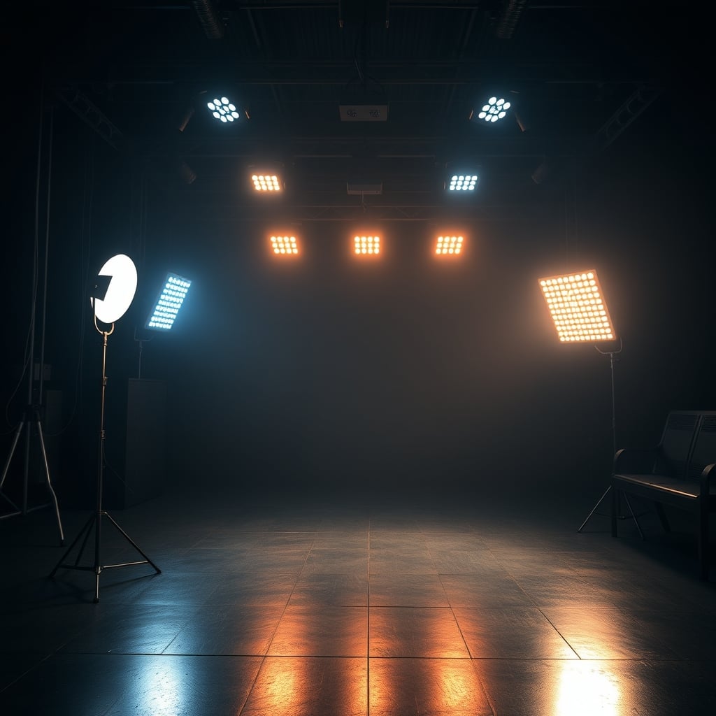
The Best Smart Light Settings Are Monochromatic
Creating seamless, blended wall washes and perfect bias lighting without visible hotspots.
- Graduated color blending eliminates harsh lines
- Excellent for behind-monitor and wall-washing applications
- Reliable and deeply integrated for automated scenes
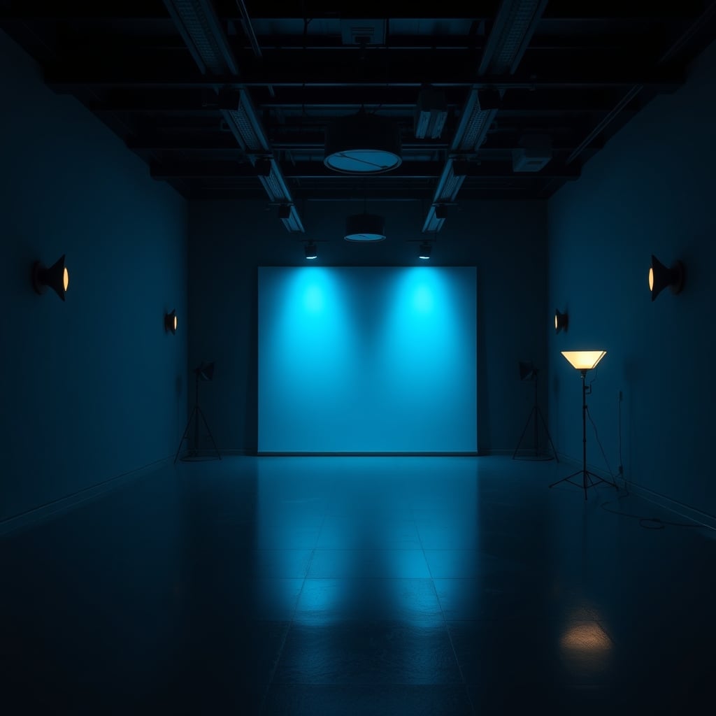
Forget the rainbow. The single most impactful shift you can make is committing to a monochromatic or analog color scheme. Pick one hue family and stick with it. A deep navy blue in the bias lighting behind your monitor, with softer slate grays washing the walls. Or a spectrum of ambers and burnt oranges, from a terracotta glow on the wall to a honey-colored desk lamp. This isn't just about aesthetics; it's cognitive load. A chaotic mix of colors fractures your visual field and subconsciously stresses you out. Based on widespread user feedback, setups that use a cohesive color story feel more intentional, more expensive, and far more calming. Your space should feel like a single, composed photograph, not a disco ball vomited on a circuit board.
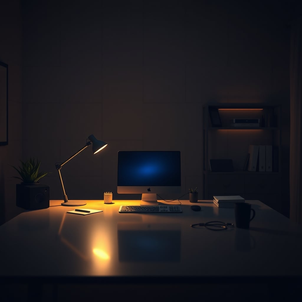
Brightness Is Your Secret Weapon (And You’re Using It Wrong)
Most people crank their ambient lights way too high, treating them like primary task lighting. This is wrong. The true power of ambient lighting is in its subtlety. Your main light source should be your monitor or task lamp. Everything else should be below that in intensity. The goal is to eliminate harsh contrast between your screen and the surrounding darkness, not to turn your room into an operating theater. A dim, warm glow from a corner floor lamp or a softly illuminated shelf does more for eye strain and atmosphere than a ceiling light at 100%. This is a known issue for long-term use: overlit ambient spaces cause more fatigue, not less. Dial it back. Way back.
The Brutal 2026 Truth About Adaptive Lighting Accuracy
You’ve read our take on the scam of adaptive lighting accuracy, but the principle applies directly to your settings. Letting an algorithm guess the “perfect” color temperature for the time of day is a crapshoot. At best, it’s a bland, slightly warm white in the evening. At worst, it clashes horribly with your fixed-color décor or monitor calibration. Don’t outsource your vibe to a robot. Manually set two or three fixed scenes that you know work: a 6500K clean white for deep work hours, a 2700K candle-like warmth for evening reading, and maybe a 2200K ultra-warm ember glow for late-night screen-off winding down. Schedule those. The consistency is more valuable than the algorithm's “perfect” guess.
Material Textures Over RGB Reflections
This is where most guides stop—at the color. They ignore the canvas. The same exact color of light will look utterly different on a matte plaster wall versus a glossy painted one, on a woven rattan shade versus a clear glass globe. You want texture and diffusion. Point your lights at surfaces, not into the room. Bounce a strip light off the back of a wooden bookshelf. Hide a bulb inside a ceramic vase. Use a linen lampshade. The light should feel like it’s emanating from the material, not from a bare LED. This creates depth, softens shadows, and kills that clinical, direct-source glare that makes smart lights feel cheap. If your lights are visible as a source, you’ve failed.
Practical Magic: The Three Scenes You Actually Need
Let’s get actionable. After testing every app, automation, and third-party controller, here are the only three scenes worth the digital real estate on your phone.
- The Deep Work Cave: 4000K white. Not warm, not cool. Just neutral. All ambient lights at 15-20% brightness, with your monitor or task light as the hero. Zero color. The goal is zero atmospheric distraction. This is the setting for writing code, editing video, or doing your taxes.
- The Evening Unwind: 2200K – 2400K. This is the color of firelight, of old incandescents. It should be orange. Crank the bias lighting behind your monitor to this (it reduces blue light contrast dramatically) and have your main ambient light follow suit. Brightness stays low. This tells your brain the workday is over, full stop.
- The Focused Energy Boost: This is the only time color gets a pass. A very specific, soft mint green or a pale lavender at 30% brightness, used for 90-minute focused sprints. There’s shaky science behind it, but anecdotally, it works as a clear psychological trigger. It’s not for all day. It’s a starting pistol.
Forget everything else. Music sync? A party trick. Gaming reactive modes? A distracting gimmick. The best smart light settings serve a purpose, not a spectacle. For a deeper dive, read about our recommended minimalist smart lights.
The Final Verdict: Worth It, But Only If You Strip It Back
Is it worth building a smart lighting system for your desk setup in 2026? Absolutely. But not for the reasons they’re selling you. It’s worth it for the constraint. For the ability to tap one button and have your entire space shift into a pre-vetted, material-conscious, cognitively optimized environment. It’s not worth it if you’re just buying another remote control for your ADHD. The real power isn't in painting your room with a rainbow; it's in the disciplined, almost monastic, use of light as an atmospheric tool. Skip the hype, skip the infinite colors, and build the three scenes that actually matter. Your focus, your mood, and your space will thank you.
Frequently Asked Questions
What is the single best color temperature for smart lights while working?
For focused screen work, a neutral 4000K white is the undisputed champion. It provides clarity without the sterile, eye-straining harshness of cooler temperatures (5000K+) or the drowsy warmth of lower temperatures. It's the closest to natural daylight without the circadian disruption.
Are reactive lighting modes (music, gaming) actually good or just a gimmick?
They are almost entirely a gimmick for productivity and atmosphere. For gaming, they are a distracting immersion-breaker. For music, they become annoying after 10 minutes. They're a party trick, not a feature for a serious workspace. The novelty wears off fast, and they sabotage your focus.
How bright should my ambient bias lighting be compared to my monitor?
Much dimmer than you think. Your bias lighting (e.g., behind the monitor) should be at about 10-20% of your monitor's peak brightness. The goal is to gently illuminate the wall to reduce harsh contrast, not to create a competing light source. If you can see the individual LEDs or it feels like a light is "on," it's too bright.
Is it worth paying extra for smart lights with high CRI (Color Rendering Index)?
For ambient and bias lighting, no. High CRI (90+) is critical for task lighting where color accuracy matters (photo/video editing, design). For the soft, colored, or warm white glows used in ambient settings, a standard CRI is perfectly fine and not worth the premium.
Written by
GlowRig Editorial researches and writes practical guides about desk setups and home office gear. Our articles are produced with the help of AI research tools and are reviewed for accuracy against manufacturer specifications and public user feedback. We may earn a commission from affiliate links, which never affects our recommendations.
Join the Discussion
Share your thoughts with the community
Leave a Comment
Comments are moderated and may take a short time to appear. Links are not permitted.